Pölzl
- Branding
- Strategy + Storytelling
- Digital Channels
Intro
Since its founding in 1987 the stonemasonry family business Pölzl stands for artisan craftsmanship and highest quality. To communicate their exceptional work and expertise the visual appearance of the company was completely reworked.

Background
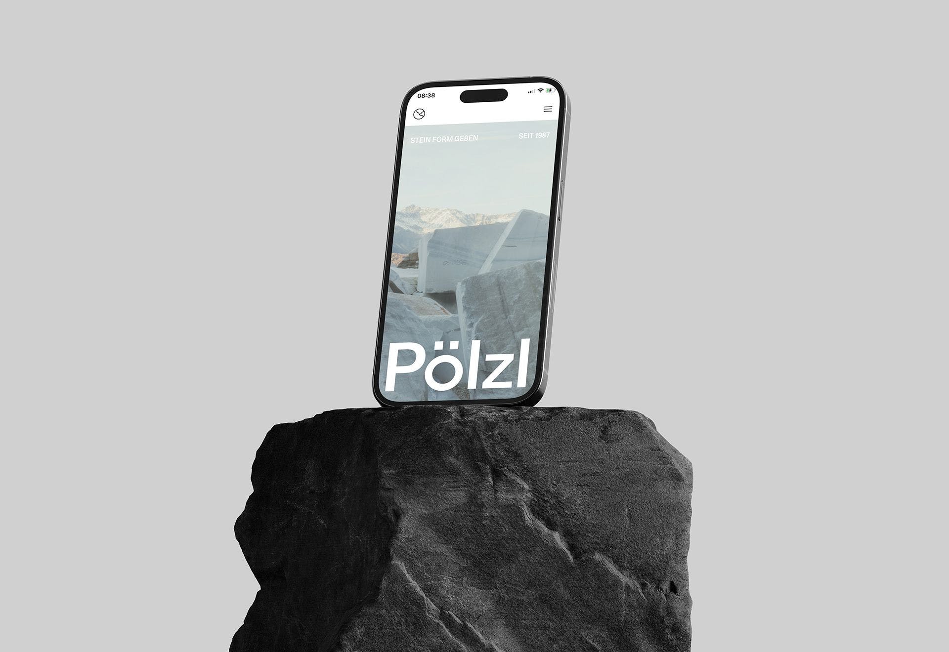
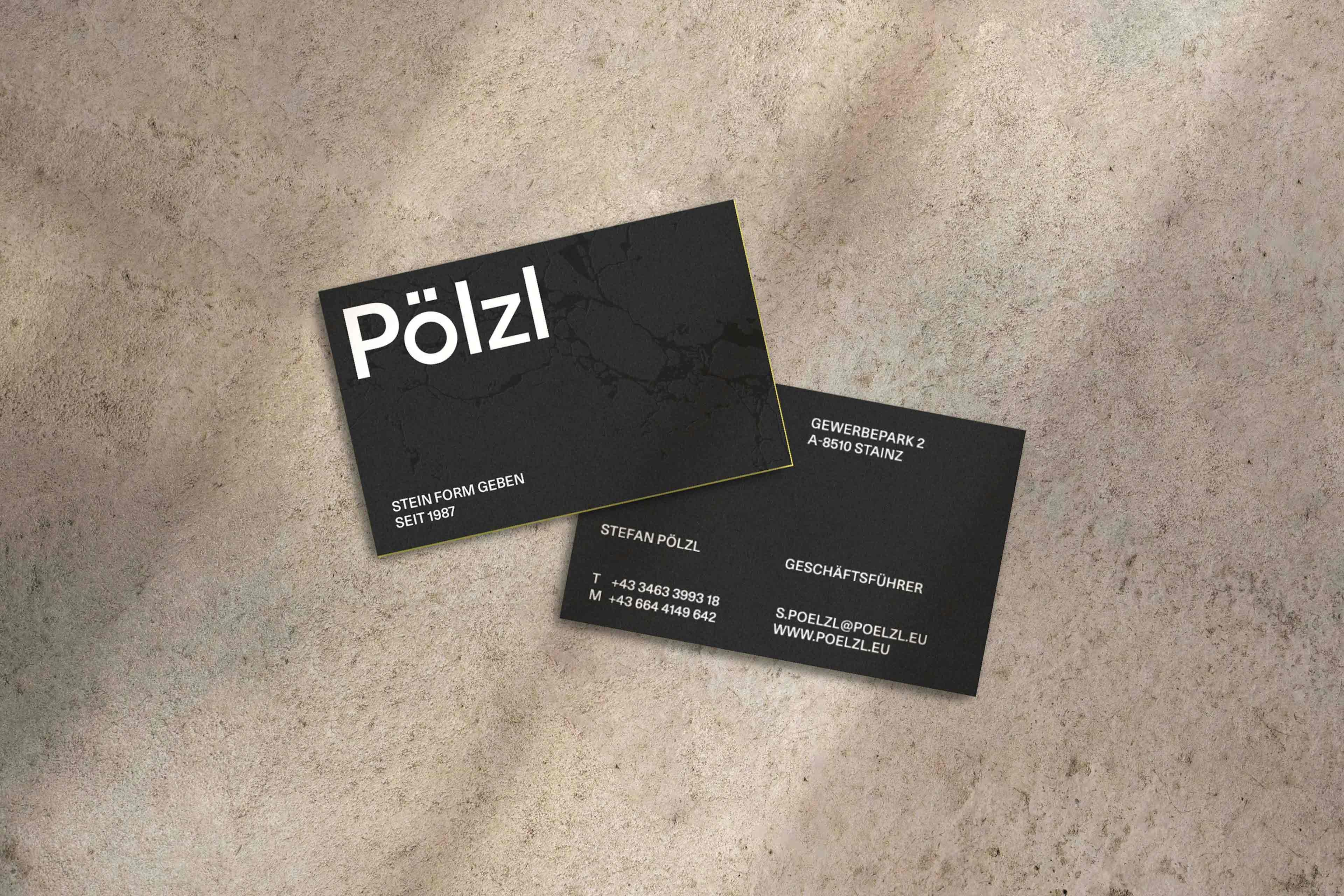
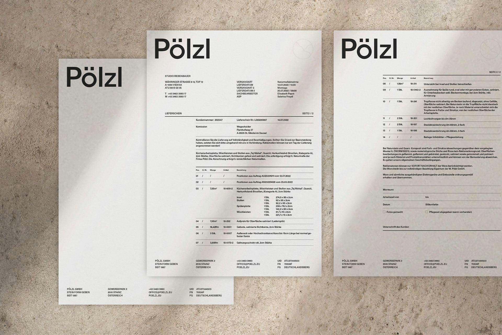
It starts with disruption. With the rethinking of rigid structures and old approaches. Facing forward. The essence of what’s important in focus. That’s what the new signet stands for which is foremost used as high quality embossing on sujets like the new letterhead. The new wordmark »Pölzl« is clear, precise and timeless. A Monolith. Derived from the font Unica 77 LL and enriched with geometrical details it serves as the foundation of the new branding.

Background
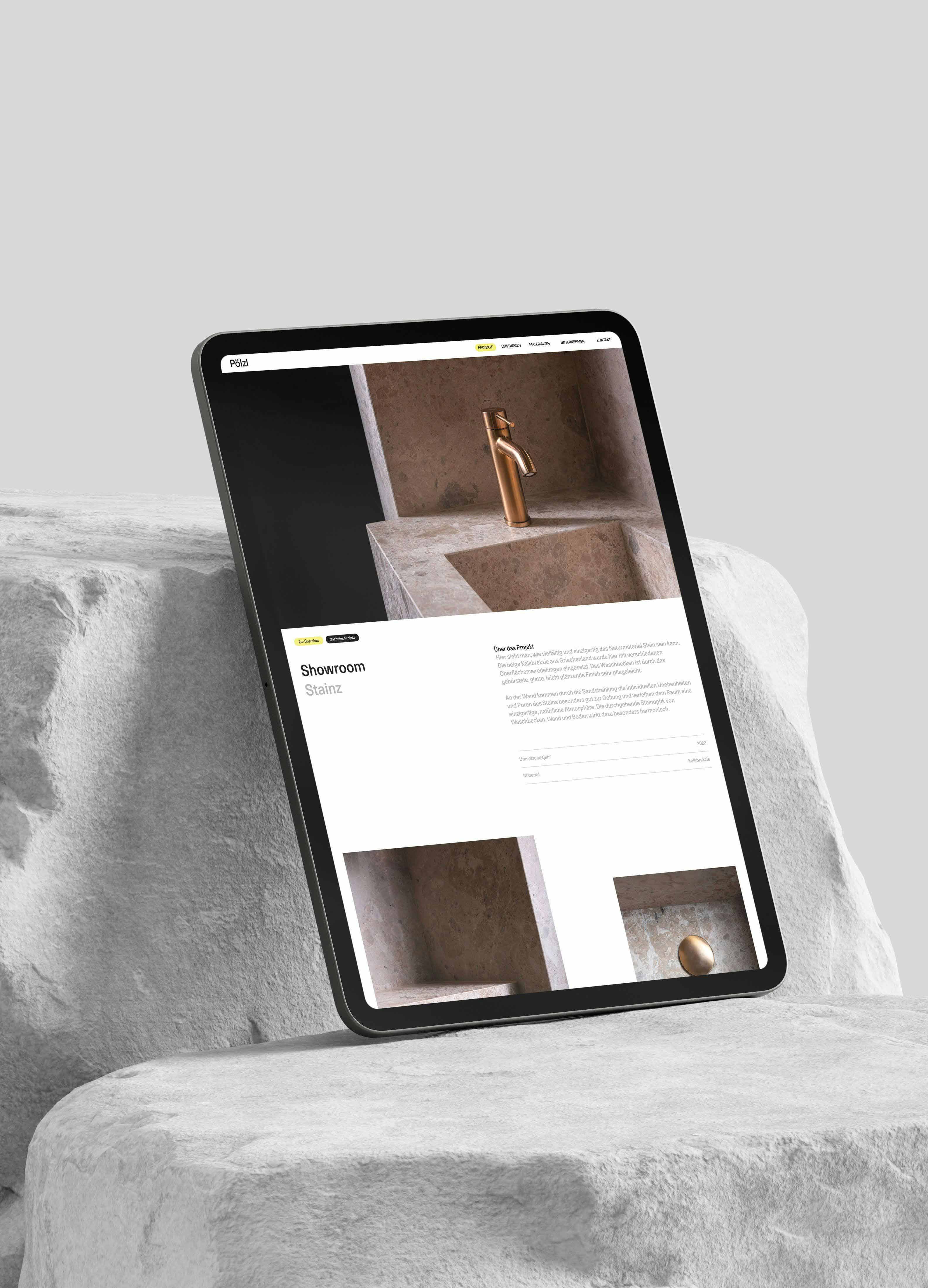
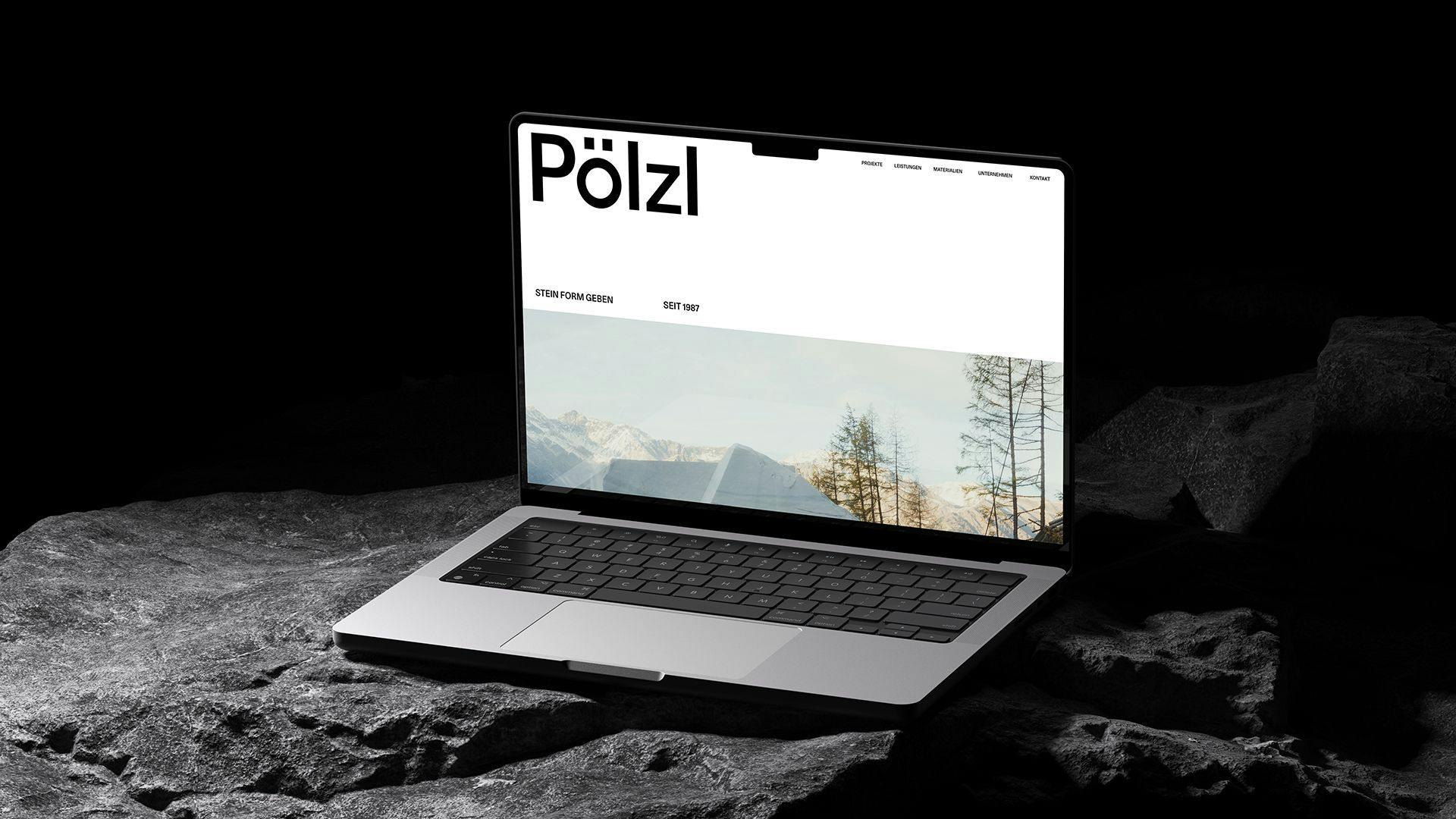
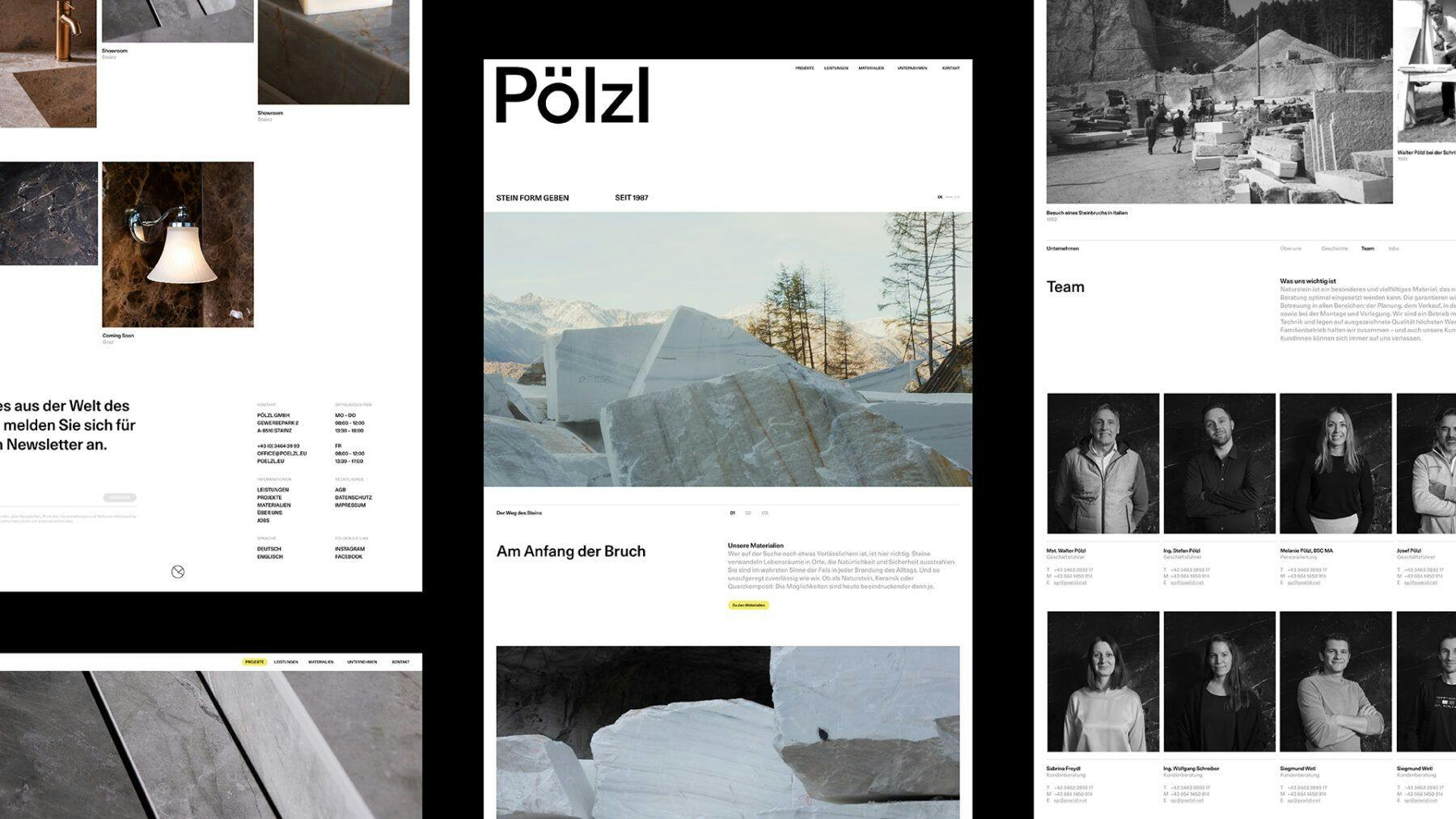
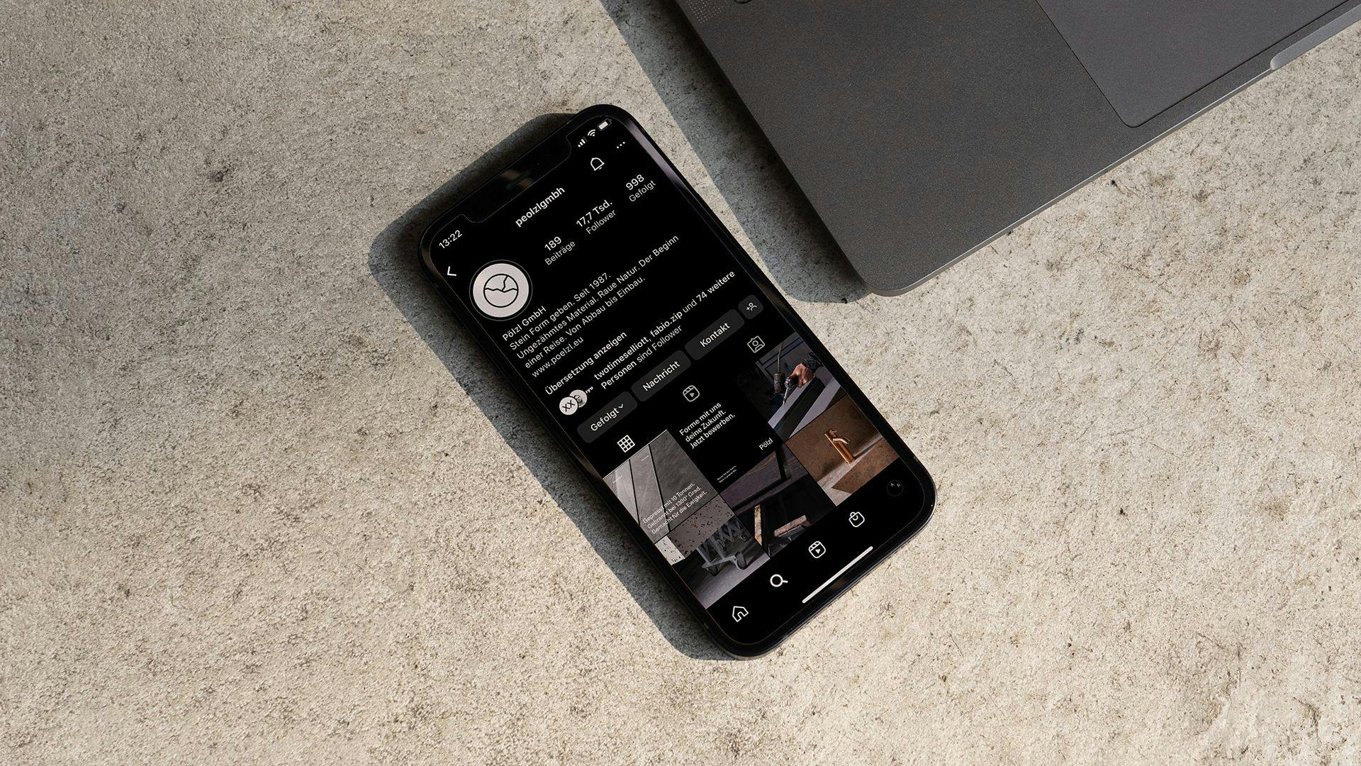
At the core of the new communication concept stands the journey of the material. The new website serves as main hub to tell this narrative and divides it into three sections and leads the user along the various steps of production from start to finish. The storytelling is supported by emotional pictures and a muted color palette inspired by the material itself. Details like coloured edges on business cards and clothings tags in a signal color yellow add character and recognisability.
Background
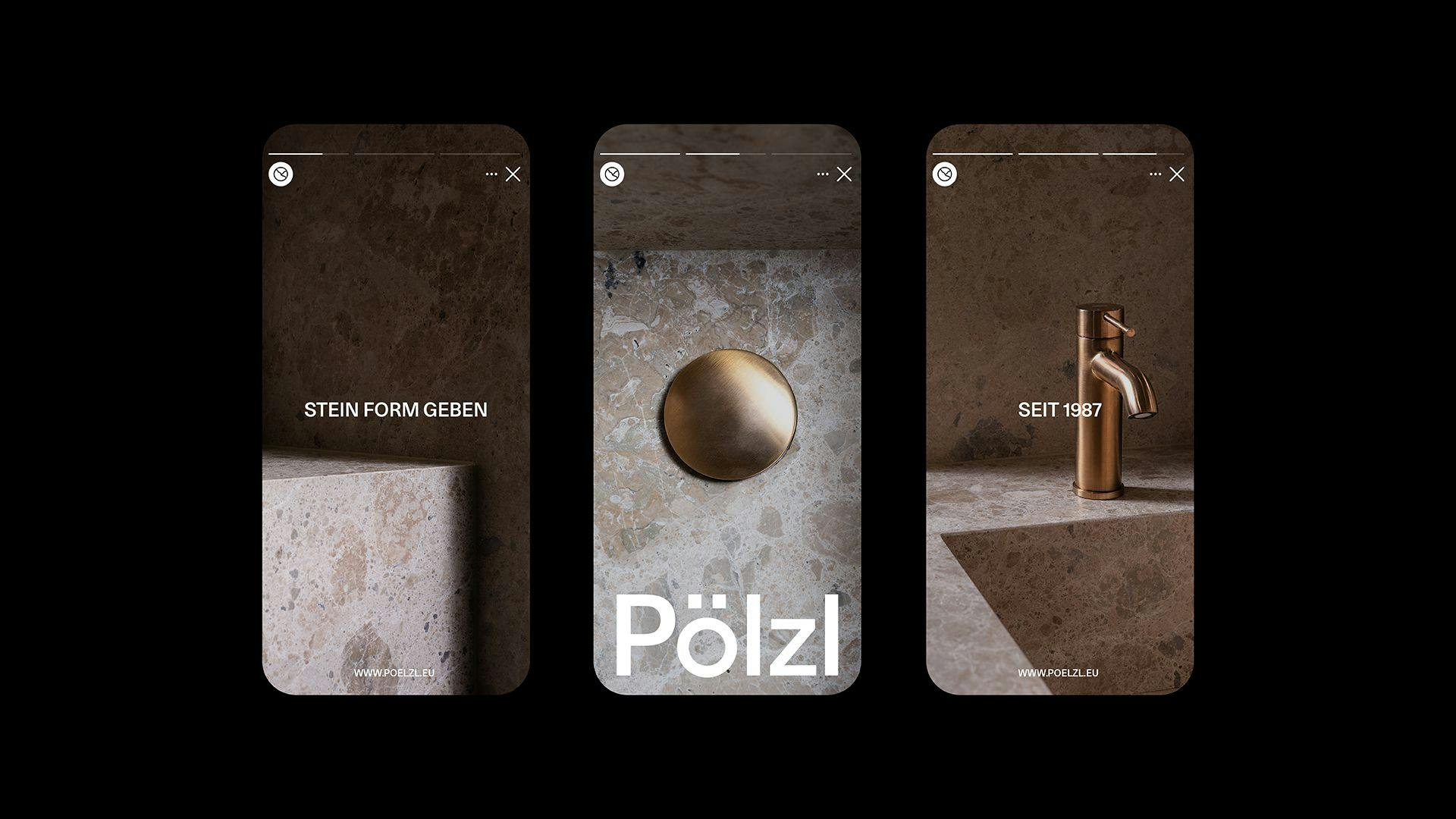
Giving stone shape – that’s what the Pölzls stand for since two generations. The new Claim »Stein Form geben. Seit 1987.« picks up on the core of their daily endeavours and embeds their drive within the new identity.
